Found in the wild
Helvetica is used when designers want text to be legible and modern. I think its interesting that they are presenting a vintage looking speaker with a font that is supposed to be “newer”. Perhaps they are wanting to show that even though the speaker could look like it’s older, there is still a modern twist on it that connects it to the present.
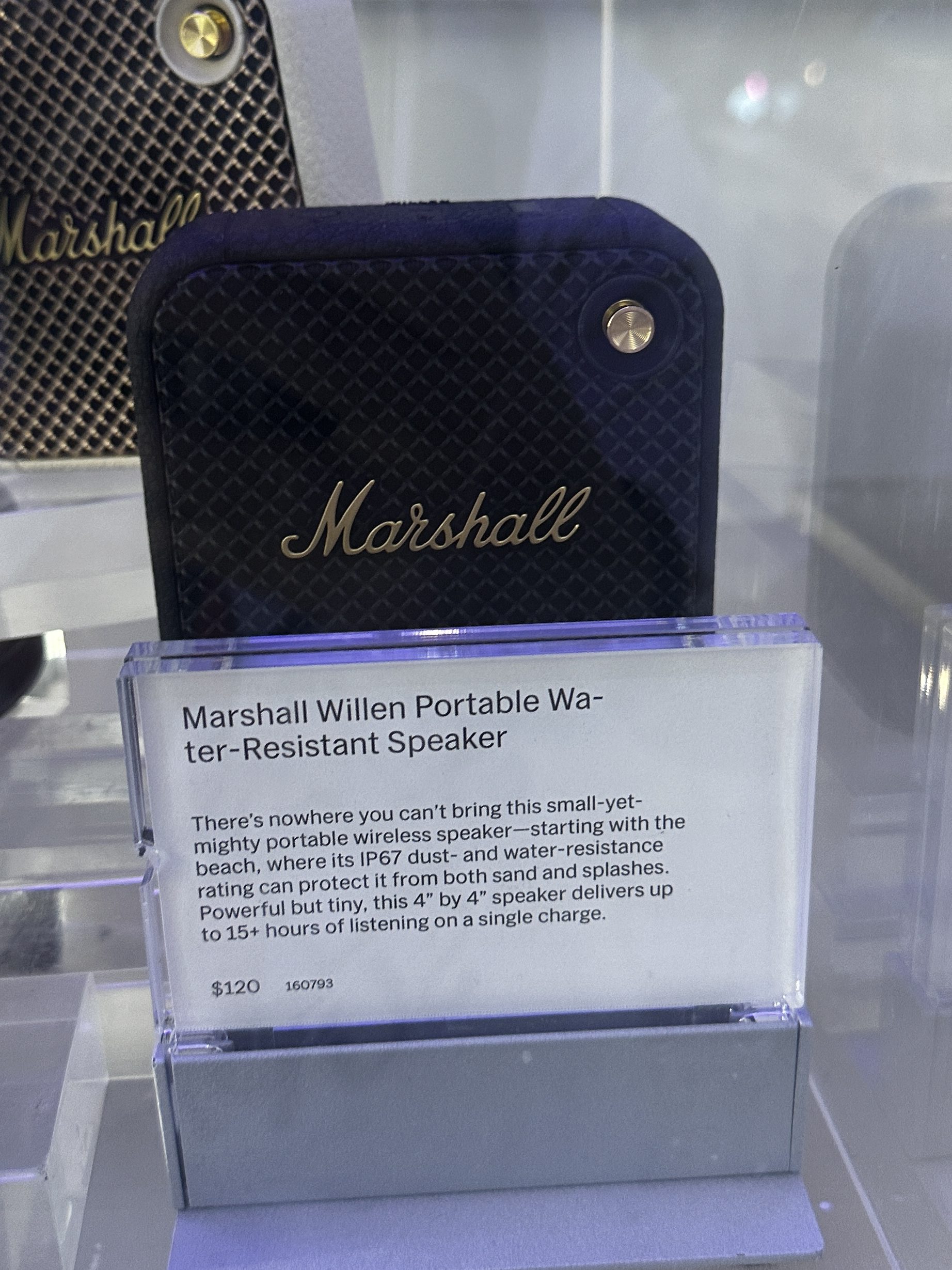
words words words

To be honest, I didn’t know much about this font before this class and watching this movie. When we were assigned to watch an entire film on a font, I thought there was no way that I would stay interested long enough to make it past 30 minutes. I was pleasantly surprised, though, and now am a big fan of this font! I chose the word neutral because it was used a lot in the film to describe Helvetica. Helvetica is simple, Helvetica is efficient, Helvetica is readable. All these ways of describing it are trying to get us to overlook this font. It’s everywhere, and its basic, but I argue that those qualities are what actually makes it one of the best fonts. The neutrality of it is what allows the font to be so widely used, what allows it to have the comfort and recognition that it does today. They talk about in the film a bit that people are concerned that Helvetica is a “global monster” and there is too much standardization within fonts now because of it, but I argue that because it is a more baseline font, it actually works to highlight the creativity of other fonts its put against.

Leave a comment