
Background
Tools
Role
Year
Figma, Unsplash
UX/UI Designer
2024
Summary
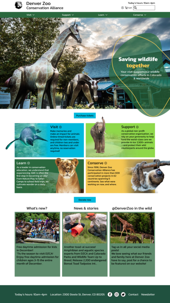
This project was a full redesign of the ticket buying process for the Denver Zoo website using Figma. The outcome of this project is a fully functioning prototype of the new ticket buying flow for the Denver Zoo Website.
My Role
I was the sole researcher and designer for this project, responsible for executing the user interviews as well as the design and development.
Challenge
As it currently stands, the ticket buying process on the Denver Zoo website is complicated and unorganized. This redesign aims to improve on those factors, as well as increase accessibility and simplicity while having limited amounts of time for research, interviews, and development.
Research
Usability Testing

To test the shortcomings of the current Denver Zoo website, I interviewed 5 people with the criteria that they have been to a zoo before. During the interview we went through the flow for buying 2 tickets to the zoo, and discussed the participants thoughts on the process. Overall the users identified that the layout of the sites were hard to navigate through, the individual pages were cluttered, and the total time it took to get tickets felt inefficient. Going into the redesign I knew I wanted to simplify the amount of pages a user clicks through, while keeping all the relevant information.
Competitive Analysis
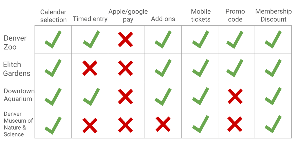
I used 3 similar websites to the Denver Zoo website to compare features across the sites, including the Elitch Gardens, Downtown Aquarium, and the Denver Museum of Nature and Science. There was a lot of similar features, including things like calendar selection, and mobile tickets which each website had, and there were things like apple and google pay which neither website had. This helped me to narrow down the features to add or take away for my redesign.
How Might We Statements
How might we increase checkout efficiency for customers so that it is easier to get tickets.
How might we change the design of the homepage for customers so that it is easier to get all of the important details in one section.
How might we display information about membership and zoo events better such that customers can be better informed about what ticket options to choose.
Design
Problem Statement
Visitors to the Denver Zoo need a streamlined way to purchase tickets because the current
system can feel overwhelming due to multiple screens, timers, and navigation options, making it
challenging for guests to complete their purchase smoothly.
User Flow

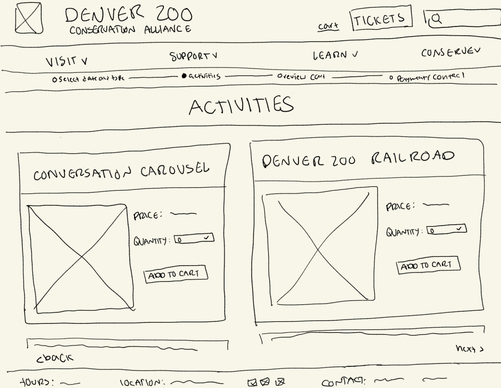
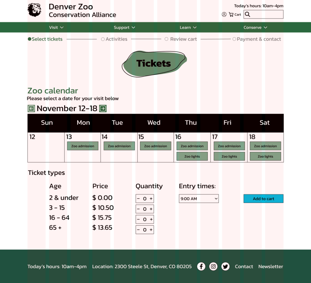
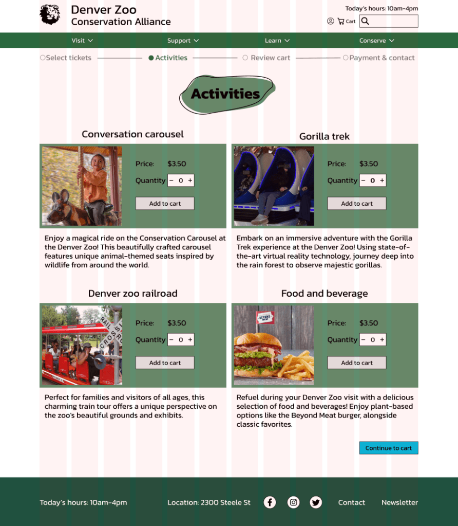
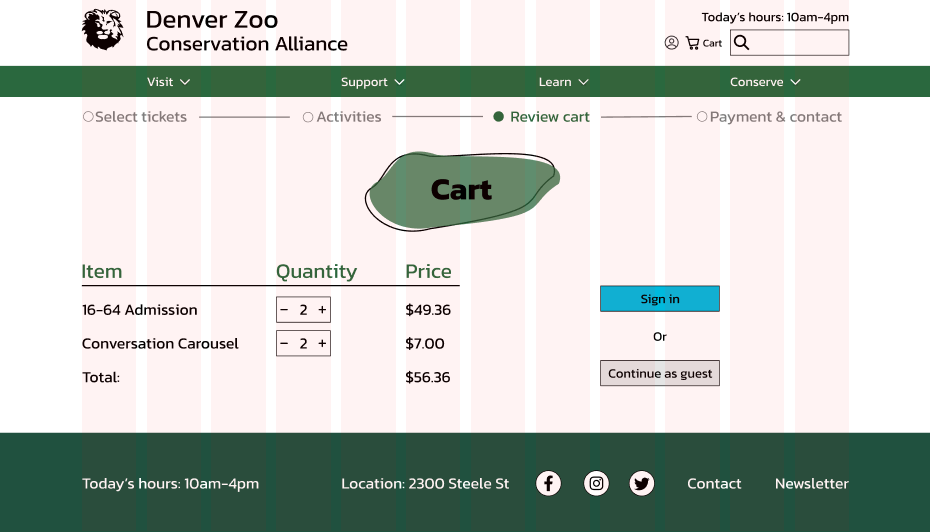
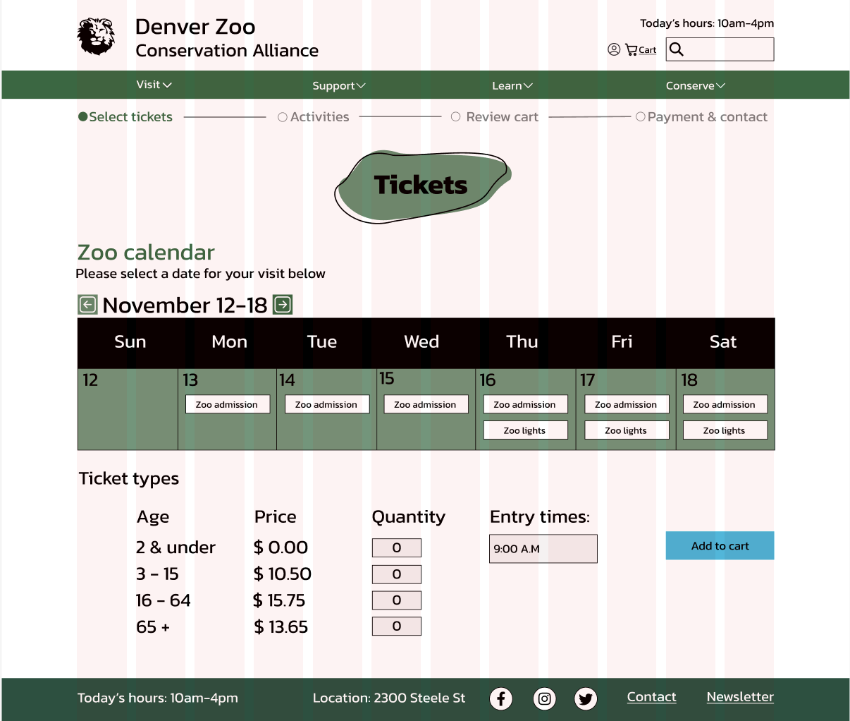
Using my research from the user interviews and the competitive analysis, I was able to identify the pages that I wanted to keep, and ones that I wanted to add to my new user flow for buying tickets. I knew I also wanted to add a progress bar above the flow to show the user how far along they were, and what was coming up.
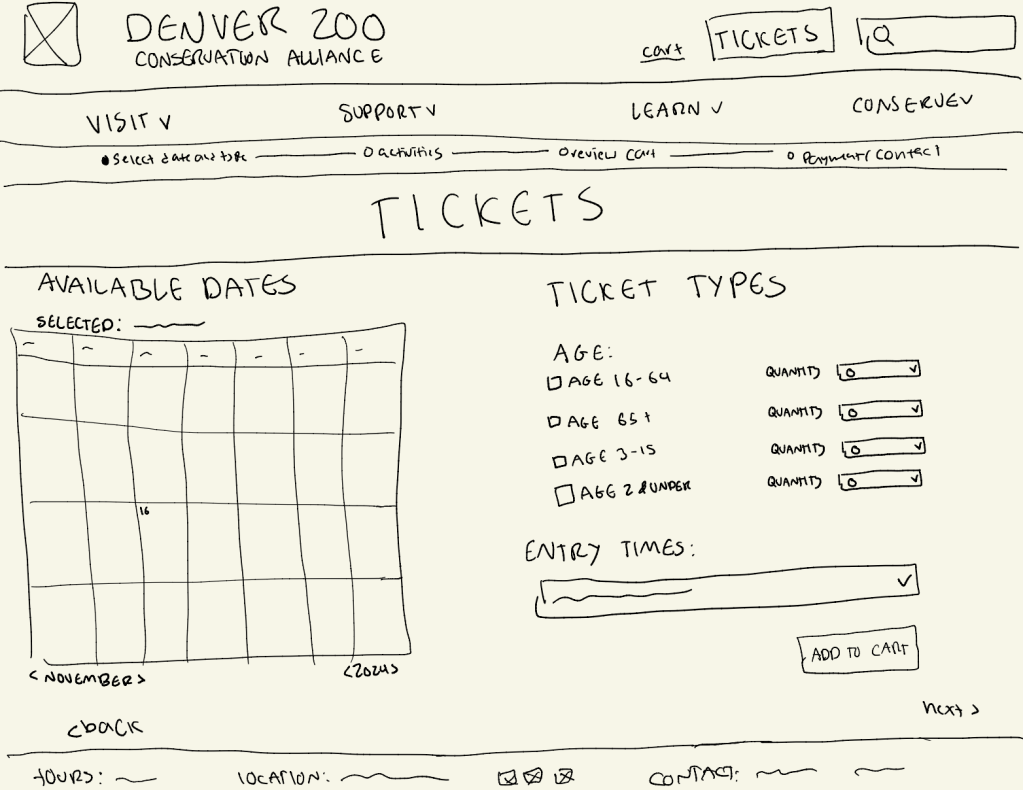
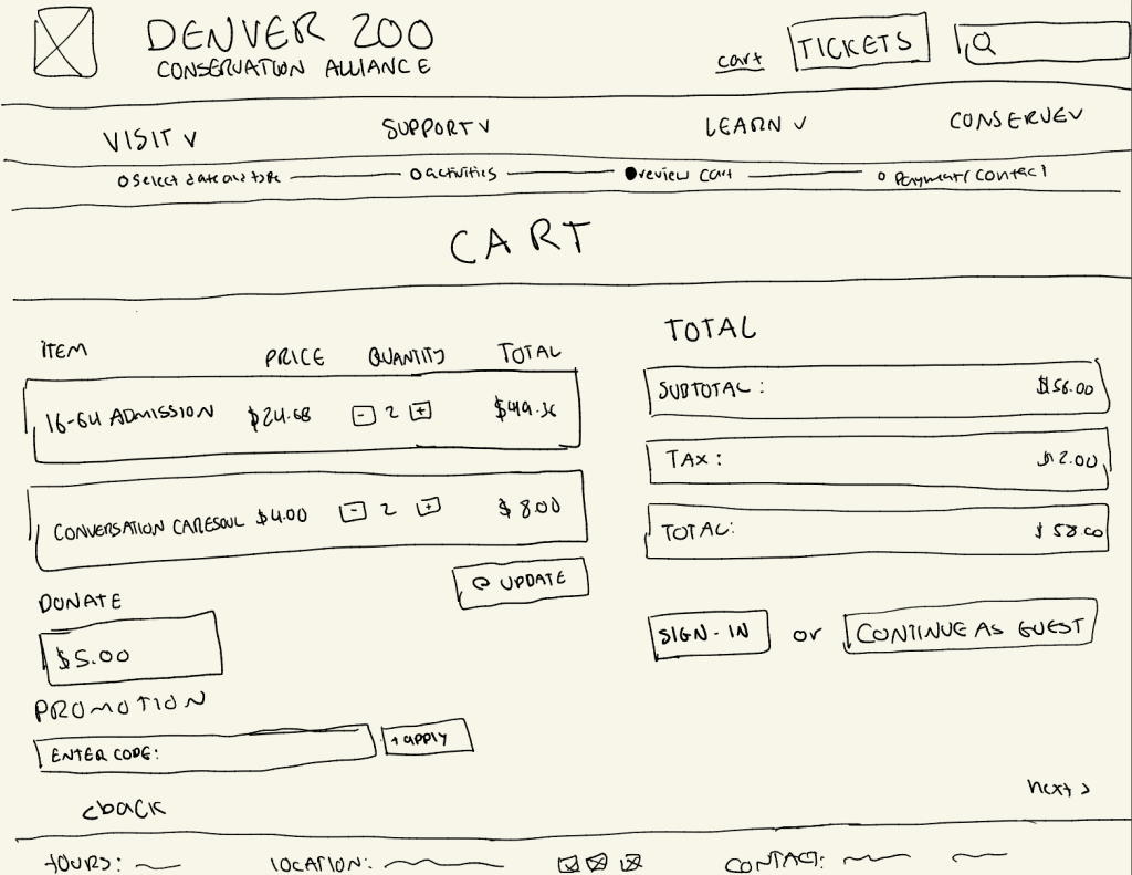

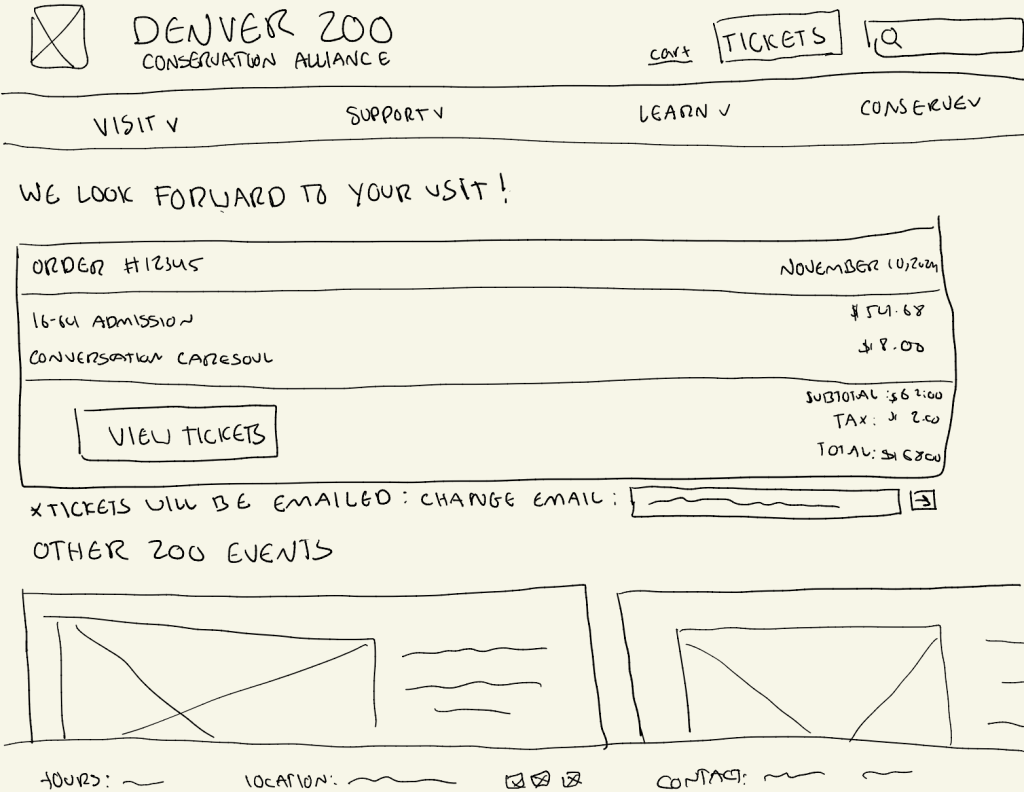
Low Fidelity Wireframes
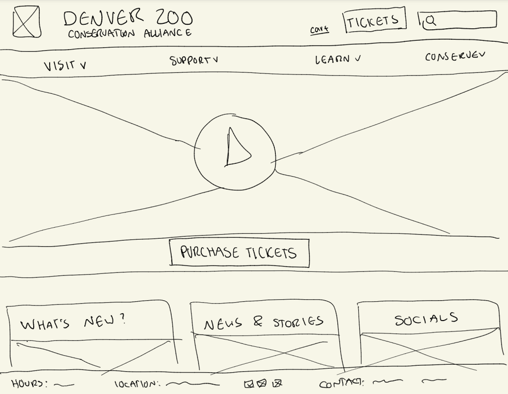
Using my user flow, I designed basic low fidelity wireframes to show what I wanted the general flow of the new website to look like. I did it by hand on Procreate on my IPad, and included both the footer and header on each page.
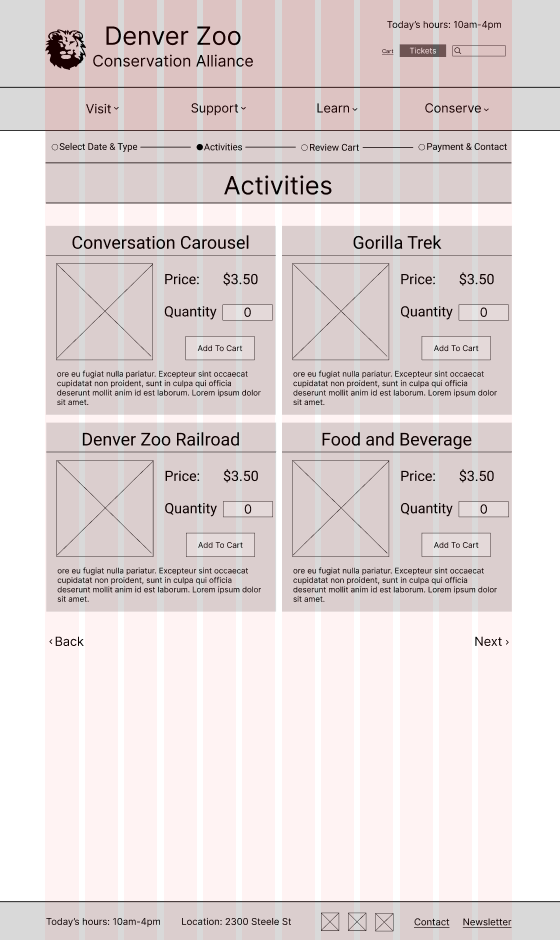
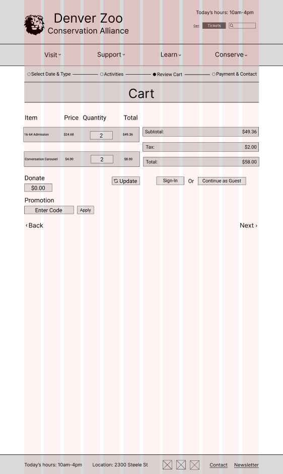
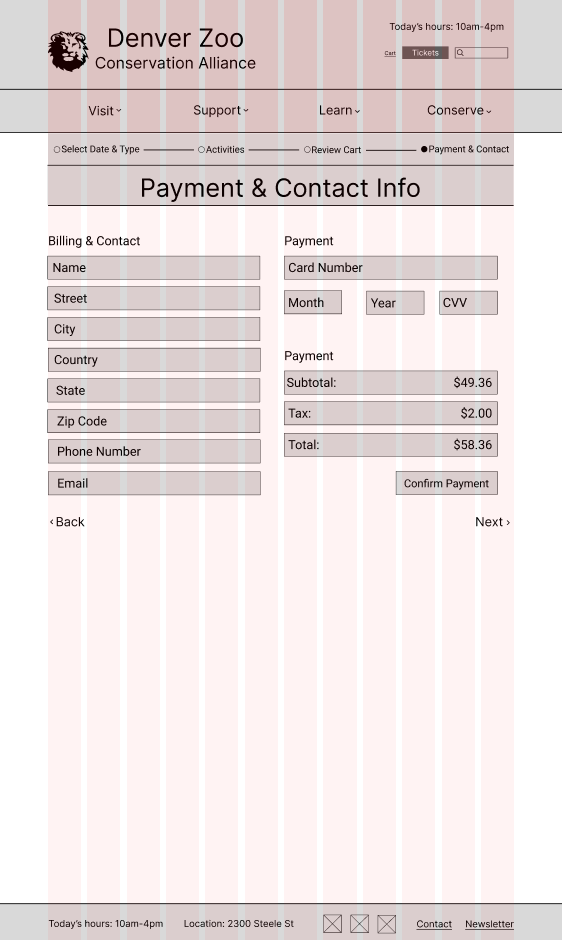
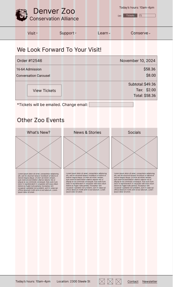
Mid Fidelity Wireframes
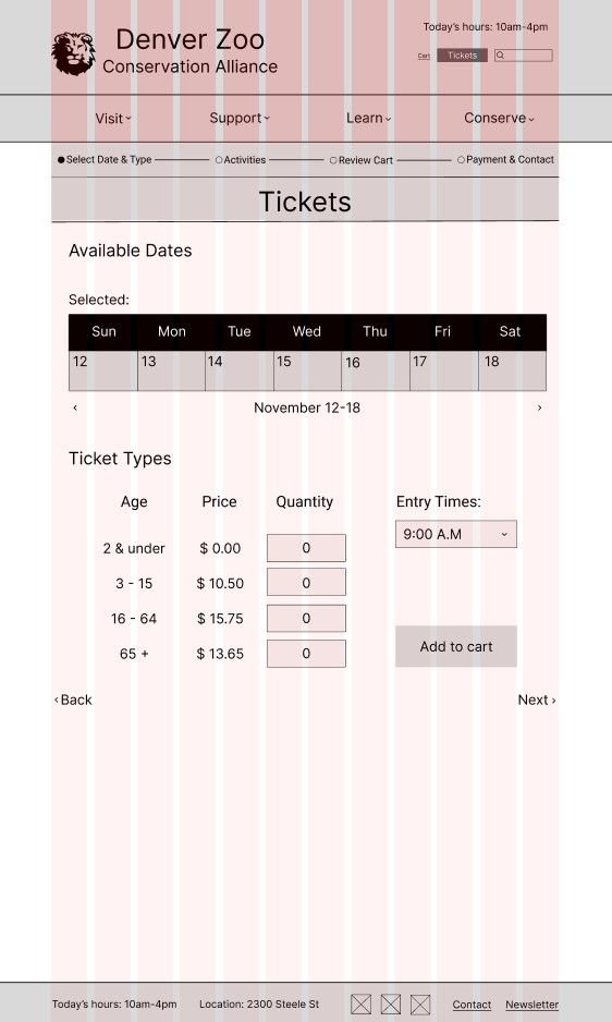
For my mid fidelity wireframes, I kept the design of my website pretty similar to my low fidelity ones and transferred it over to Figma, but decided to change the calendar view to weekly because the zoo only lets you buy tickets one week in advance.

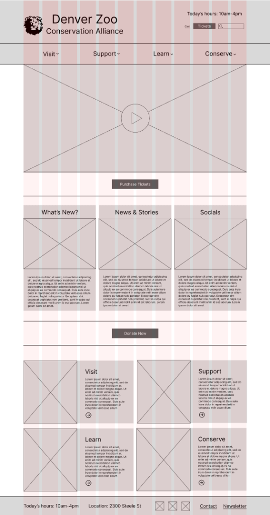
High Fidelity Wireframes
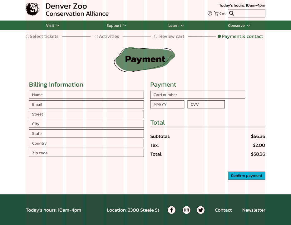
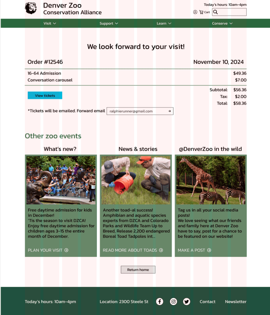
I went through 2 rounds of high fidelity prototyping. For my first round, I took my mid fidelity wireframes and developed them with color and pictures, and made them more polished. I linked the pages together on Figma using the prototype feature to create a prototype of my new flow with limited functionality.
Intructor Feedback
Throughout this design process, I received lots of feedback from my instructors, which was a lot of help when we go into developing it more in Figma. A lot of repeated comments I got were about aligning content, wether that be vertically or horizontally, in multiples of 8 or on the grid spacing. I also got feedback about things similar to color accessibility, sizing of some of my elements, and how things were arranged.

Evaluation and Results
More User Testing
I then received instructor feedback and went through another round of user testing, this time only with two people. I used a similar method of testing like I did when first interviewing people about the original website, I asked them to walk through the prototype and recorded the thoughts and comments they had. For the instructor feedback I got comments just about polishing up my high fidelity wireframes to make them look for professional. For example splitting my buttons into one main button, and a secondary button to split up my content. For the user feedback, I got comments on how to make my flow run smoother. For example I forgot to add a continue to cart button on my activities page, and both my users reccoment I add plus and minus buttons for the ticket selection.
Reflection
Future Plans
If I had more time, I would work on refining my high fidelity wireframes more. I would want to have a more fleshed out prototype with more pages mocked up, and more parts of each page to interact with. I would also want to work more on the design of the pages, as I feel like while they are nice and simplistic, they could have some more visual elements.
Conclusion
Taking on a project of this size in only one semester taught me a lot about how to manage my time and split up tasks that needed to be done for each iteration of the design and development process. I enjoyed getting to have experience in both UX research and design, and I have an appreciation now for when i look at websites knowing how long these mockups and prototypes take to make. With the skills I learned from doing this project, I hope to apply it to more complex projects in the future, and keep improving my knowledge and skills in Figma and as a researcher.

Leave a comment